 The demographic of my magazine is 13 to 17 year old teenage girls, at this age I think appearance, socialising and rebelling against your parents is what their main priorities lay. I think my magazine attracts teenage girls using these things. For example, on the cover of my magazine I have used a teenage girl who is around the same age as my target audience. She has long blond hair, clear skin, blue eyes and the typical 'girl next door' look. Stereotypically this is what most teenage girls want in them self. She is looking directly at the camera which makes her easy to engage with the reader as it is as if she is looking straight at them. I also tried to use artists that teenage girls would easily recognise and be in to such as The Wanted and JLS. When looking back through my questionnaires I have noticed that half of the questionnaires completed said that the artists mentioned on the cover would make them buy my magazine. The other half mentioned that the eye catching house-style colours in the masthead would make them buy it, the mention of free competitions and a free gig, and the main feature caught someones eye. I think all these things mentioned would appeal to my audience age group as the people I asked where within this age group. The eye catching colours was something I mentioned at the beginning of this coursework as the thing I would use to lure my audience in. Looking at my audience feedback I feel as if I have achieved this, and that it works to lure in the teenage girl population.
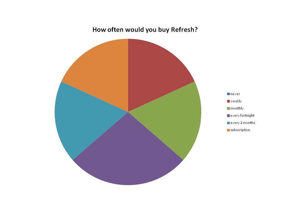
 Other feedback given included negative feedback. One thing mentioned a lot was the fact that there are too many gaps on the front cover. I agree with this criticism, as the front cover does look bare compared to a real music magazine. When constructing the front cover I think I was trying to show case the photo by not having a lot on the front cover. The background also made it hard to put text over it and to change the colour because of the colour in the background. One person suggested that I should of used a more interesting type face and this would make them less interested in the magazine as it looks plain. Another person suggested using something eye catching this would be something like a splash or a flash. Someone else suggested that on my contents I should include more information on the contents of each sub-heading about what each feature includes. Overall, people said the same negative things about the magazine. I asked each person who filled in a questionnaire if they would by this magazine all of them said yes, I then asked them how often and two said monthly, two said weekly, two would subscribe, two said every fortnight, and two said every two months. This is shown in the graph below.
I think I have made this magazine a little bit too expensive for my age range at £3.00, as the majority of the people who filled in my questionnaire said they would pay £2.00 or £2.50 for it. However, some people said they would pay £3.00 for it but these where the people who said they would buy it monthly, whereas the people who said £2.00 where the people who would either buy it weekly or fortnightly or only every two months. This suggests that either the people who would pay weekly for it wouldn't be prepared to pay £3.00 a week but would at £2.00, or that the people who said they would buy it every fortnight or every two months don't buy music magazines very often and when they do they are only prepared to pay £2.00 for them.
No comments:
Post a Comment